I have finished working at the school and am now working with the hospital team again. No rest for the wicked. I thought I might have a few days off for half-term, but no. I did have a lean few months before Christmas, so the life of a temp is to work when you can and is why I can take a few weeks off in the summer in the off-season. I managed to find time over the weekend to make a few pretty things, even though I didn’t know what to do with myself. Here is something I may actually put in an art journal.
I got out my 6×6 inch gel plate and the stamp platform. I received a new stencil in the post, hearts. This isn’t usually my thing, but it was cheap and I thought I might find a use for it. I have a lot of Acrylic Artist’s Ink and thought I would try it on the gel plate to see what would happen. I started with yellow. The ink beads up on the plate and you get a lot of white spots. I tried the cyan and the same thing happened. However, because the ink is translucent, there was optical blending on the print and I still managed to get white spots. See above left. The effect is like putting salt on damp watercolor. Registering the print with the stamp platform is so easy now and I don’t have to worry about the pulls not lining up. As the ink is translucent an wet, there is virtually no paint left on the plate to worry about and wipe off. I added process magenta onto the plate and placed the heart stencil on and pulled the print on the left. The stencil is smaller than the gel plate which gave me a nice border. I pulled the stencil off the plate and managed to pull a ghost print on the right. The ink does funny things on the gel plate, but I like it.
I pulled some more prints onto drawing paper using yellow, blue, and a green. I really like this watery effect and thought I would use these as backgrounds to collagraphs. I have something fishy in mind. I also found some cartridge paper I had pre-cut and made some more as I was in a zone and wanted a better quality of paper for the collagraphs.
It is amazing how each one came out differently. I decided I had enough of using green, blue and yellow and wanted to use the primary colors to see how that would work.
The prints turned out differently depending on what color I put down first. As these colors are translucent, they should optically blend on the paper. If you were to mix these colors together, you would get brown. However, that didn’t happen here and I got some lovely clean mixes.
I had a couple of prints that didn’t turn out so great. One was a pick up print. I got my trusty seagull stencil and placed it on my print and used indigo blue on the gel plate. I may still get out some colored pencils or paint to tidy them up a bit, but I learned a while ago that if a print doesn’t come out well or if it is too busy, then only keep part of it with a stencil. I like these better now.
Not only do I have some nice backgrounds to print on, I also have a library of backgrounds that I can print off in the future for any collage work I may want to do. Win-win. Thanks for stopping by!


 This mixed media piece is A3 size and I really don’t like it. Really. Nothing is ever going to make me like it as it is. So, I cut it down to two 8×8 inch pieces. Now they look like this:
 I’m not sure if they are finished, so I will just hang onto them for now. It is good practice to keep your work even if you don’t like it as you may find some other use for them. In any event, I like them better this way.
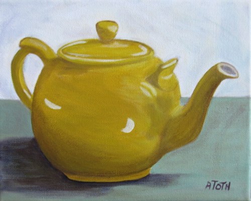
 I cut out the teapot and used contact paper to water/paint-proof the stencil. Then I made many prints. What I considered to be ‘unsuccessful’ went into a pile while I considered what to do with them.


